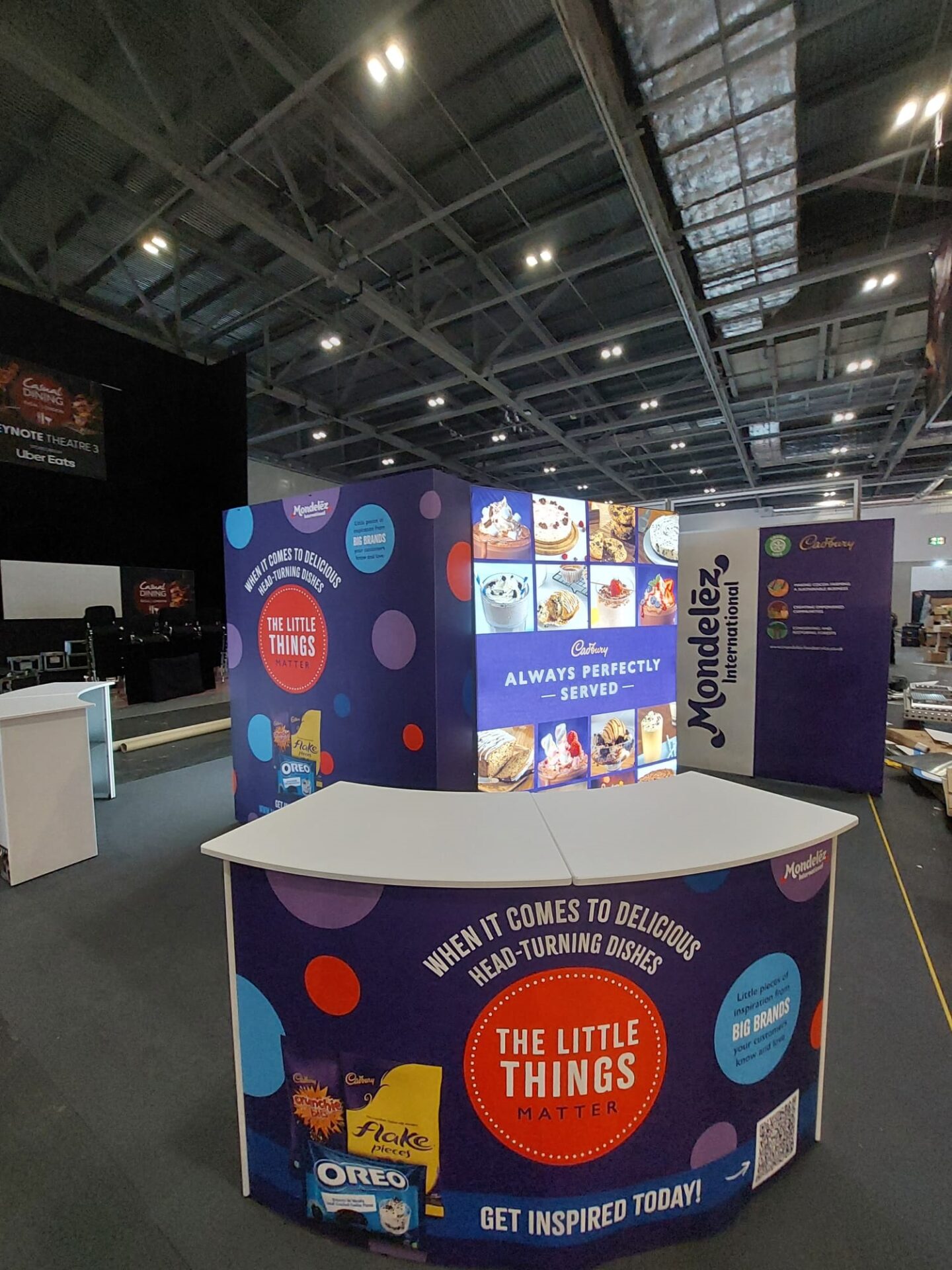
98% of our senses are geared to visual imagery, it’s the most important sense we have.

You need to use eye-catching powerful graphics and keep the message simple.

Remember the ’ three-second rule’: three seconds is all the time it takes a visitor to walk past and sum up most stands. A successful exhibition stand will display graphics that inform the target audience of who the company is, what the company does and most importantly what the company can do for its customers, within those three seconds.

Keep it clean, simple and bold

Use as little text as possible, use bright bold colour and images, but don’t clutter your stand with too many images. Fewer and larger images are better than many small ones, certainly no smaller than A3.

Make sure your name and message are visible above head height both from close up and from a distance, have nothing important on the walls below 3 feet.

Get creative

New technology means graphics can be produced much quicker with excellent definition. Special effects can also be created with print and finishing techniques. You can use backlit graphics to highlight certain areas.
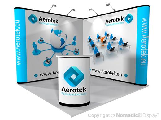
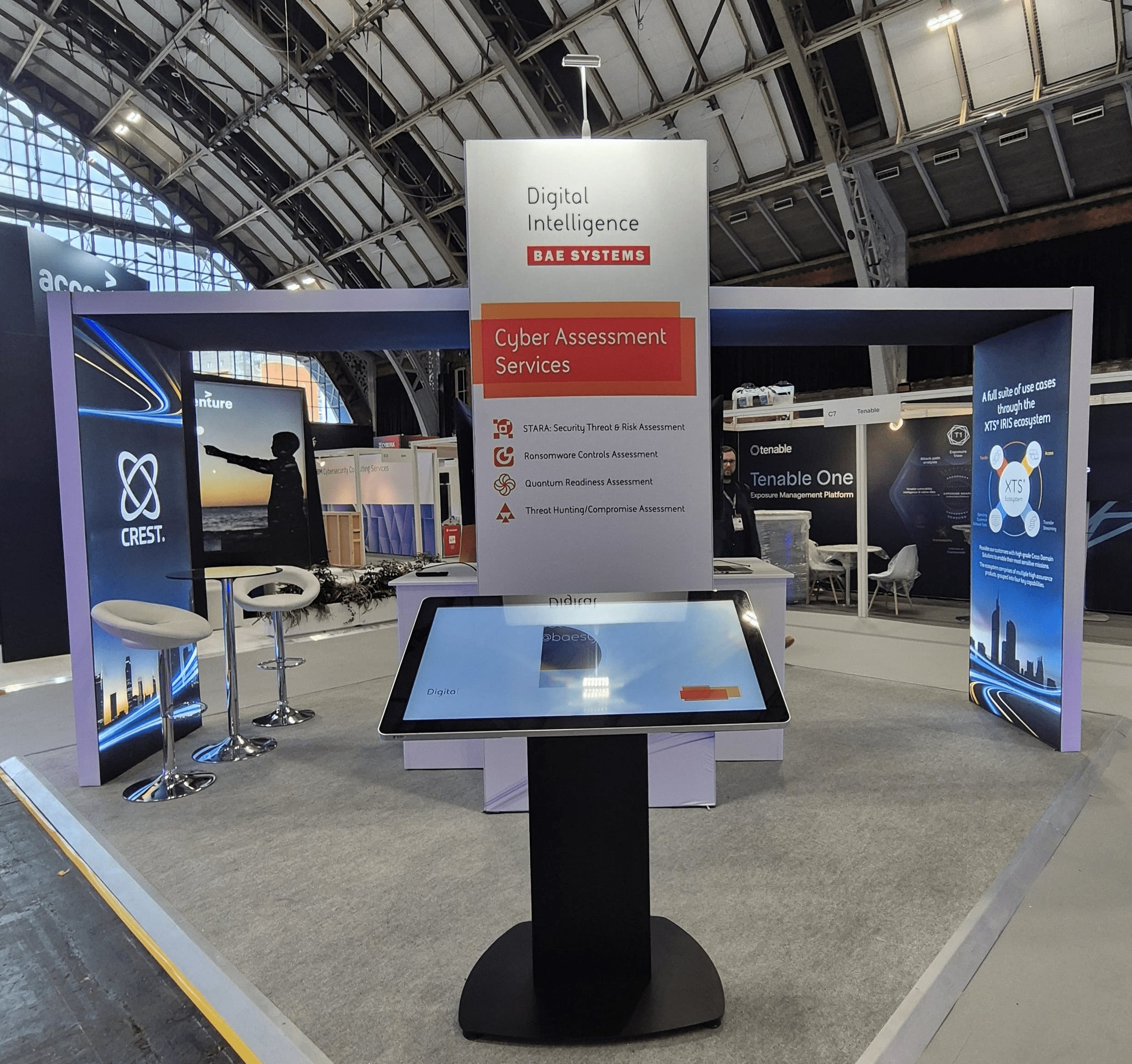
Even the finish of the graphics will change the look of them: gloss finish will really bring out the colours you use, but you will encounter reflections, particularly in photographs: matt finish creates a subtle feel and in general will be more scratch-resistant.

Make it memorable

You can position a stunning graphic at a strategic point to catch people as they walk past. But make sure one of your stand staff is there and ready to approach the visitor to capitalise on the arresting start.

Make sure your stand is memorable; try to show your product or service in a stunning way that visitors simply cannot miss. If your product cannot work like this, think of other ways to attract attention to your stand – as we said earlier ‘be noticed’.

Choose colours carefully

Give some thought to the use and the co-ordination of the colours you have chosen.

Apparently:

  • Red means vibrant and appealing
  • Blue has a cooling, calming effect
  • Green is a conservation colour and also has a calming effect without the chill
  • Yellow means attention, sunshine and happiness
  • Orange means cheap offers
  • Black means power and might
  • White means honesty and purity
  • Wood has a warm comforting quality about it

Take these statements with a pinch of salt if you want but do consider your colour scheme carefully.

Find out more about how Nomadic Display can help you with display graphics.